Composite Curves
Overview
Composite curves are fundamental tools in heat exchanger network design and pinch analysis. They combine multiple individual stream H-T curves into aggregate hot and cold profiles, enabling graphical and numerical determination of MITA, UA, and thermodynamic feasibility (Linnhoff & Hindmarsh, 1983).
Construction
Individual Stream Curves
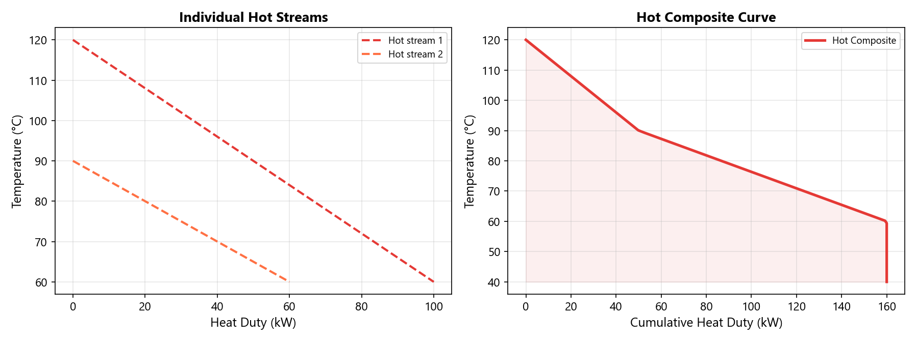
Each stream is characterized by its temperature-enthalpy (T-H) curve, built via PH flashes as described in the segmented interval method. The curve goes from the highest temperature (Q = 0) to the lowest temperature (Q = Q_total).
Combining Multiple Streams
For the hot side (analogously for cold):
- Collect temperature breakpoints from all hot stream T-H curves
- Sort in descending order (highest T first)
- At each temperature \(T_k\), interpolate the cumulative Q from each stream's curve
- Sum the contributions:
Interpretation
Temperature-Heat Duty Diagram
The composite curves are plotted on a T-Q diagram where:
- x-axis: Cumulative heat duty (kW)
- y-axis: Temperature (K or °C)
- Hot composite: Red curve (descending left to right)
- Cold composite: Blue curve (ascending left to right)
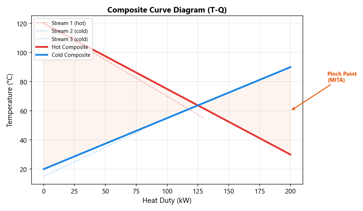
Key Points on the Diagram
| Point | Meaning |
|---|---|
| Pinch point | Location of minimum temperature difference (MITA) |
| Hot end | Where the hot composite enters at its maximum temperature |
| Cold end | Where the cold composite enters at its minimum temperature |
| Overlap region | Range of Q where both composites exist — this is where heat is exchanged |
MITA and Pinch Point
The Minimum Internal Temperature Approach occurs at the pinch point — the location along the exchanger where the hot and cold composites are closest:
Feasibility Check
If MITA < 0 at any point, the hot composite crosses below the cold composite. This indicates a thermodynamically infeasible design — the specified conditions cannot be achieved without violating the Second Law.
The pinch point divides the exchanger into two thermodynamically independent regions:
- Above the pinch: Heat surplus — hot streams have more heat than cold streams can absorb
- Below the pinch: Heat deficit — cold streams require more heat than hot streams provide
Flow Direction Effects
Counterflow
In counterflow, both composites are traversed in the same direction (from high-T end to low-T end). At fraction \(f\):
- Hot composite: \(Q_h = f \cdot Q_{h,\text{total}}\)
- Cold composite: \(Q_c = f \cdot Q_{c,\text{total}}\)
This produces the maximum overlap and highest thermal efficiency.
Co-current
In co-current flow, the cold composite is reversed relative to the hot:
- Hot composite: \(Q_h = f \cdot Q_{h,\text{total}}\)
- Cold composite: \(Q_c = (1 - f) \cdot Q_{c,\text{total}}\)
This typically results in a larger MITA (less efficient) compared to counterflow.
Implementation Details
The MSHX plugin displays composite curves in the built-in OxyPlot chart:
- Solid thick red line: Hot composite curve
- Solid thick blue line: Cold composite curve
- Dashed thin lines: Individual stream curves (color-coded by role)
- Axes: Heat Duty (kW) on x-axis, Temperature (K) on y-axis
The chart updates automatically after each successful calculation, providing immediate visual feedback on the heat exchange process and pinch point location.